F5 Data: A Swiss Army Knife for Storm Chasers Adds Some Superb New Tools

I first began using F5 Data in 2007, and despite its early developmental quirks and my own vast lack of experience at forecasting, I fell in love with it. Storm chaser and program designer Andrew Revering had a solid and unique concept, one that gave me an ample tool for both learning forecasting and chasing storms. In particular, its configurable overlay of RUC maps on top of my GR3 radar images (via Allisonhouse’s data feed) appealed to me. At a glance, I could get a good idea of the kind of environment storms were moving through and into. And I had more than 160 parameters to choose from. I hadn’t an inkling what most of them were for, but they were available to me if ever I learned.

In 2008, Andy made significant upgrades to his product with the addition of color shading and contouring, GFS at 3-hour intervals out to 180 hours, a calculator for instantly converting various units of measurement to other units of measurement ( such as meters per second to knots and miles per hour), and other improvements.  The result not only looked attractive and professional, but it offered more solid bang for the buck–and at a little over $14.00 a month, the bucks were easily affordable.

Map Overlays: An Immensely Useful Feature

500 mb Heights

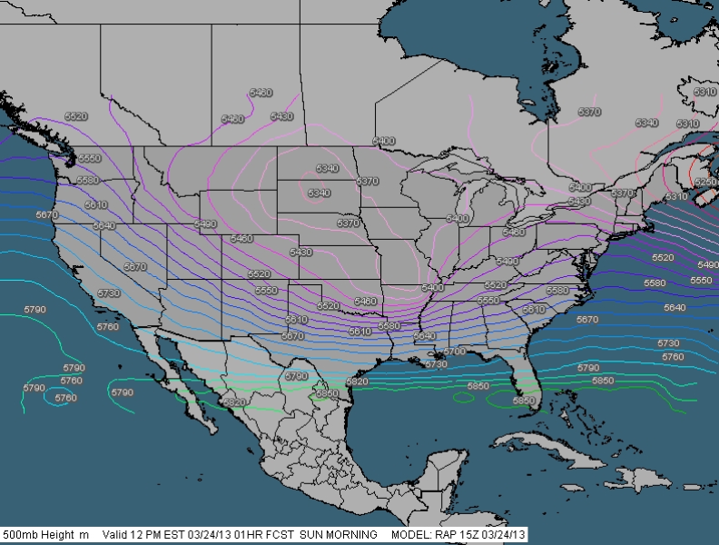
CONUS view showing 500 mb height contours. Note: Images shown here do not correspond to the text example.

At the same time, my own forecasting skills were slowly improving, and as they did, I came to greatly value another key feature of F5 Data: its ability to layer any of its maps on top of each other. This is a hugely useful feature and one I haven’t seen in any other commonly available forecasting resource that doesn’t require more technical skills than I possess. F5 Data is easy and intuitive to use, and as my knowledge grew, so did my appreciation for its map overlays.

F5 Sample Overlays

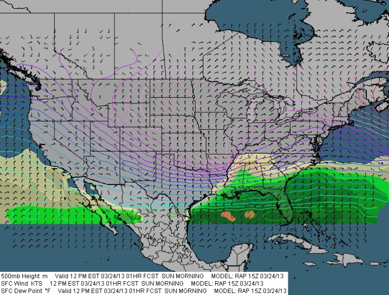
CONUS view with shaded surface dewpoints and surface wind barbs added to 500 mb heights contours. Labels for dewpoints have been turned off.

F5 Overlays Zoomed

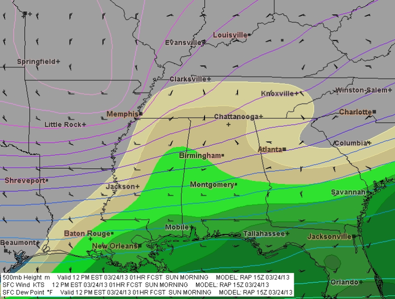
Same overlays as above zoomed in to selected area.

Say, for instance, I’m looking at the NAM 48-hour forecast for 21Z. I select the 500 mb heights map, choosing the contour setting, and see a trough digging into New Mexico, with diffluence fanning across the Texas/Oklahoma panhandles up into Kansas. How is the boundary layer responding? Switching from contours to shading, I select sea level pressure, and now, superimposed on the H5 heights, I can see a 998 mb low centered in southwest Kansas. Another click adds surface wind barbs, which show a good southeasterly flow toward the low, with an easterly shift across northern Kansas suggesting the location of the warm front. Hmmm, what’s happening with moisture? Deleting the SLP map–I don’t have to, but too many maps creates clutter–I select surface dewpoints. Ah! There’s a nice, broad lobe of 65 degree Tds stretching as far north as Hutchinson, with a dryline dropping south from near Dodge City into Oklahoma and Texas. Another click gives me an overlay of 850 mb dewpoints, revealing that moisture is ample and deep. Still another click shows a 70 knot 500 mb jet core nosing in toward the panhandles.

You get the idea. I can continue to add and subtract maps of all kinds–surface and mixed-layer CAPE, 3 km and 1 km storm-relative helicity, bulk shear, 850 mb wind speed and directional barbs, EHI, STP, moisture convergence, and whatever else I need to satisfy my curiosity about how the system could play out two days hence. I can see at a glance favorable juxtapositions of shear, moisture, lift, and instability per NAM. And I can make similar comparisons with GFS, and on day one, with RAP (which replaced RUC in May 2012).

And Now the Upgrade: Presenting Version 2.6

Everything I’ve written so far has been to set a context for what follows, which is my review of the latest major upgrade to F5 Data. It comess at a time when the number of forecasting products available online has greatly expanded and old standbys have updated in ways that make them marvelously functional. Notably, a number of years ago TwisterData gained rapid and massive acceptance among storm chasers, and it continues to enjoy prominence as a quick, one-stop resource. Like F5 Data, it features GFS, NAM, and RAP, and it also offers point-and-click model soundings, a very handy feature. In 2010, the HRRR brought hourly high-resolution maps to the fray, with its forecast radar images demonstrating considerable accuracy. And the SPC’s Mesoanalysis Graphics, always a stellar chase-day resource, has recently made some dynamite improvements. Today the Internet is a veritable candy store of free forecasting resources.

GR3 with F5 mesoanalysis overlay. This one shows surface and 850 mb Tds and 850 wind barbs. (The blue wind barbs are an Allisonhouse product.)

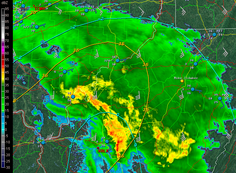
GR3 with F5 mesoanalysis overlay. This one shows surface and 850 mb dewpoints and 850 mb wind barbs. (The blue METARs are an Allisonhouse product.)

At the same time, F5 Data didn’t seem to be doing much, and while I still resorted to it constantly, I wondered whether Andy had lost his passion and commitment to his product. Most troubling to me, the proprietary mesoanalysis maps which had replaced the RUC maps as GR3 overlays often failed to update in a timely manner, rendering them pointless. Given their potential usefulness in the field–how valuable would it be, for instance, to see at a glance that the storm you’re following is moving into greater instability and bulk shear?–I found this disappointing.

But I no longer have any such concerns. This latest upgrade has rendered F5 Data a powerhouse. All the while, Andy was beavering away in the background, fixing bugs and incorporating various client requests into his own set of huge improvements to his creation. Beginning with the February 1, 2013, release of v. 2.5 and moving in seven-league strides toward the latest version, 2.6.1, these changes have been a long time coming, they reflect a lot of work on Andy’s part, and they have been well worth the wait.

Here’s What Is New

The following will give you a quick idea of the more significant changes:

  • NAVGEM has been added to the F5 suite of forecast models.
  • Users can now draw boundaries, highs, and lows.
  • Users can select increments other than the default by which arrow keys advance forecast hours for the different models
  • The map now offers an experimental curved-Earth projection.
  • Wind barbs at different levels can be overlaid to provide visuals of speed and directional shear.
  • Processing is faster (up to 45 minutes faster with GFS)
  • Text for geographic maps can now be customized.

And yes, the mesoanalysis maps are now on the money. Andy moved them to a faster server, and they now update regularly and consistently, to the point where I plan to display some of them on my site the way I used to do with the F5 Data RUC maps.

All of the above are in addition to the already existing array of features. A few of these include the following:

  • Over 160 parameters, including ones you just don’t find elsewhere, such as the Stensrud Tornado Risk and isentropic surfaces, and also a good number of proprietary products such as the APRWX Tornado Index, APRWX Severe Index, and APRWX Cap.
  • Current conditions plus five forecast models: GFS (out to 384 hours), NAM, RAP, hourly mesoanalysis, and the newly added NAVGEM.
  • Mesoanalysis integration with radar products via Allisonhouse (already described).
  • A point-and-click CONUS grid of forecast soundings.
  • Zoom capabilities that let you zero in on areas of interest. Activate the display of cities and roads and target selection gets that much easier.
  • National satellite (visible, water vapor, and infrared) and base reflectivity radar composites.
  • Fully customizable map overlays (as discussed above).
  • 14 categories of maps organized for particular purposes, including Severe, Tornado, Hurricane, Cold Core, Winter, Lift, Shear, and Moisture. These are fully customizable, and you can create your own categories if you wish.
  • Watch and warning boxes.

To describe all of the features that F5 Data offers would take too much space and isn’t necessary. You can find out more at the F5 Data website, which includes a whole library of video tutorials on what F5 Data is and how to use it.

Better yet, you can download the software (it’s free) and try it out for yourself with 17 free maps.

If there is any downside to the upgraded F5 Data, it is minor and purely personal. I miss the passing of the historical data feature some months prior to the main upgrade. That feature allowed me to request data for past forecast dates and hours so I could study chase setups from years gone by. I wish I still had that option. However, I understand that it needed to go in order for Andy to move ahead with his changes. The feature was peripheral to the purpose of F5 Data, evidently it didn’t get used much, and it’s a small price to pay for the big improvements to this forecasting resource.

One thing Andy might consider for a future update would be to break down SBCAPE and MLCAPE contours into smaller increments. CAPE is displayed by intervals of 100 from 0–500 J/kg, which is great; but from 500 up to 3,000, it jumps by units of 500 J/kg, and from 3,000 on up it moves 1,000 J/kg at a time. Realistically, these are just overviews of instability, and they’re in keeping with how most other forecast resources display CAPE. If you want to get more granular, you can always check out forecast soundings. Still, it’s an opportunity for F5 Data to provide a somewhat more incremental breakdown similar to that of TwisterData.

With these last two comments dispensed of, I highly recommend to you the new and improved F5 Data. It’s easy to use and flexible as all getout, and it puts a squadron of tools at your disposal, all in one eye-pleasing, zoomable interface. Of course, no one forecasting resource covers all the bases, and that is certainly true of F5 Data. But this is nonetheless a fabulous product that offers some unique advantages. These latest changes, including the addition of NAVGEM, the ability to draw boundaries, and mesoanalysis graphics that update regularly to provide the most current information, have taken an already fine resource and made it dramatically more useful.

Bravo, Andrew Revering! You do great work.

This review, by the way, is unsolicited and unpaid-for. I’ve been a fan of F5 Data and of Andy from the start, and I’m pleased to share my thoughts about the latest iteration of a product I’ve used extensively and benefited from for a good number of years.


Mesoanalysis Maps Now Available

If you’ve used the F5 Data RUC maps on my Storm Chasing page, then you’ll be pleased to know that, after a couple of days being unavailable, the maps are once again up, with some significant changes that I think you’ll like.

My initial intention when I took the maps down was to install RUC loops in their place, but I hit a snag. It’s just a temporary one, but in the meantime, I’ve decided that instead of reinstalling the original RUC maps, I’d switch to the new mesoanalysis maps that F5 has recently added to its suite of forecasting tools. I like them well enough that I may not even bother with the RUC loops. You can find plenty of sources for RUC, but not for these, so the mesoanalysis maps should give you a different and useful resource. Besides being proprietary to F5 Data in themselves, they include a couple of trademark indices that Andy Revering has formulated for capping and sigtors.

Check them out and let me know what you think. I welcome your comments.

RAOB and Other Weather Widgets

Some storm chasers pride themselves in being minimalists who have a knack for intercepting tornadoes without much in the way of gadgetry. Others are techies whose vehicles are tricked out with mobile weather stations and light bars. It’s all part of the culture of storm chasing, but the bottom line remains getting to the storms.

To my surprise, while I draw the line at gaudy externals, I’ve discovered that I lean toward the techie side. For me, storm chasing is a lot like fishing. Once you’ve bought your first rod and reel and gotten yourself a tackle box, you find that there’s no such thing as having enough lures, widgets, and whizbangs. You can take the parallels as deep as you want to. Radar software is your fish finder. F5 Data, Digital Atmosphere, and all the gazillion free, online weather maps from NOAA, UCAR, COD, TwisterData, and other sources are your topos. And so it goes.

A couple years ago I spent $300 on a Kestrel 4500 weather meter. It’s a compact little unit that I wear on a lanyard when I’m chasing. It weighs maybe twice as much as a bluebird feather, but it will give me temperature, dewpoint, wind speed, headwinds, crosswinds, wind direction, relative humidity, wet bulb temperature, barometric pressure, heat index, wind chill, altitude, and more, and will record trends of all of the above.

I use it mostly to measure the dewpoint and temperature.

Could I have gotten a different Kestrel model that would give me that same basic information for a third of the cost, minus all the other features that I rarely or never use? Heck yes. Nevertheless, I need to have the rest of that data handy. Why? Never mind. I just do, okay? I need it for the same reason that an elderly, retired CEO needs a Ferrari in order to drive 55 miles an hour for thirty miles in the passing lane of an interstate highway. I just never know when I might need the extra informational muscle–when, for instance, knowing the speed of crosswinds might become crucial for pinpointing storm initiation.

If I lived on the Great Plains, with Tornado Alley as my backyard, I might feel differently. But here in Michigan, I can’t afford to head out after every slight-risk day in Oklahoma. Selectivity is important. I guess that’s my rationale for my preoccupation with weather forecasting tools, along with a certain vicarious impulse that wants to at least be involved with the weather three states away even when I can’t chase it. Maybe I can’t always learn directly from the environment, but I can sharpen my skills in other ways.

Does having all this stuff make me a better storm chaser? No, of course not. Knowledge and experience are what make a good storm chaser, and no amount of technology can replace them. Put a $300 Loomis rod in the hands of a novice fisherman and chances are he’ll still come home empty-handed; put a cane pole in the hands of a bass master and he’ll return with a stringer full of fish. On the other hand, there’s something to be said for that same Loomis rod in the hands of a pro, and it’s not going to damage a beginner, even if he’s not capable of understanding and harnessing its full potential. Moreover, somewhere along the learning curve between rookie and veteran, the powers of the Loomis begin to become apparent and increasingly useful.

Now, I said all of that so I can brag to you about my latest addition to my forecasting tackle box: RAOB (RAwinsonde OBservation program). This neat little piece of software is to atmospheric soundings what LASIK is to eye glasses. The only thing I’ve seen that approaches it is the venerable BUFKIT, and in fact, the basic RAOB program is able to process BUFKIT data. But I find BUFKIT difficult to use to the point of impracticality, while RAOB is much easier in application, and, once you start adding on its various modules, it offers so much more.

RAOB is the world’s most powerful and innovative sounding software. Automatically decodes data from 35 different formats and plots data on 10 interactive displays including skew-Ts, hodographs, & cross-sections. Produces displays of over 100 atmospheric parameters including icing, turbulence, wind shear, clouds, inversions and much more. Its modular design permits tailored functionality to customers from 60 countries. Vista compatible.

–From the RAOB home page

The basic RAOB software arrived in my box a couple weeks ago courtesy of Weather Graphics. It cost me $99.95 and included everything needed to customize a graphic display of sounding data from all over the world.

I quickly realized, though, that in order to get the kind of information I want for storm chasing, I would also need to purchase the analytic module. Another $50 bought me the file, sent via email directly from RAOB. I downloaded it last night, and I have to say, I am absolutely thrilled with the information that is now at my disposal.

Here is an example of the RAOB display, including skew-T/log-P diagram with lifted parcel, cloud layers, hodograph, and tables containing ancillary information. Click on the image to enlarge it. The display shown is the severe weather mode, with the graphs on the left depicting storm character, dry microburst potential, and storm category. (UPDATE: Also see the more recent example at the end of this article.)

The sounding shown is the October 13, 2009, 12Z for Miami, Florida–a place that’s not exactly the Zion of storm chasing, but it will do for an example. Note that the negative area–that is, the CIN–is shaded in dark blue. The light blue shading depicts the region most conducive to hail formation. Both are among the many available functions of the analytic module.

The black background was my choice. RAOB is hugely customizable, and its impressive suite of modules lets you tailor-make a sounding program that will fit your needs beautifully. Storm chasers will want to start with the basic and analytic modules. With that setup, your $150 gets you a wealth of sounding data on an easy-to-use graphic interface. It’s probably all you’ll ever need and more–though if you’re like me, at some point you’ll no doubt want to add on the interactive and hodo module.

And the special data decoders module.

Oh yeah, and the turbulence and mountain wave module. Gotta have that one.

Why?

Never mind. You just do, okay?

ADDENDUM: With a couple storm seasons gone by since I wrote the above review, I thought I’d update it with this more timely image. If you’re a storm chaser, you’ll probably find that what the atmosphere looked like in May in Enid, Oklahoma, is more relevant to your interest than what it looked like in Miami in October.

Guest Blog: Storm Chaser Andrew Revering on How to Forecast Northwest Flow Events

Regarding tornado potential…with storms moving southeast or even south in some cases, you have to keep in mind that the storm-relative inflow will have to shift in order to maintain a good, dry updraft and support supercellular structure.

Welcome to the first guest post in my new, improved Stormhorn.com blog! I’m pleased to feature Andrew Revering sharing his insights on forecasting northwest flow chase scenarios. Northwest flow seldom produces severe weather; however, some noteworthy tornadoes have occurred in northwest flow. I’m delighted to have Andy share his knowledge about how to forecast the rare chaseworthy setups.

Andy is the proprietor of Convective Development, Inc., and the creator of the unique, enormously powerful F5 Data forecasting data feed and software. A meteorology student both privately and in educational institutions for his whole life, Andy has been a storm chaser for 15 years, four of which he served as a contract storm chaser for KSTP, an ABC-TV affiliate in Minneapolis. Andy started writing weather software in 1996 as a high school senior, developing such programs as AlertMe, APRWeather, WarnMe, StormGuide, AlertMe Pro, SkyConditions, and F5 Data. His current projects include F5 App, F5 Maps, and CellWarn.

During the nearly three years that I’ve used Andy’s F5 Data, I’ve been impressed not only with the power of the product, but also with the knowledge, friendliness, and helpfulness of its creator. Without further preamble, here he is, helping you to get a better handle on…

FORECASTING CHASEWORTHY NORTHWEST FLOW SCENARIOS
By Andrew Revering

The weather pattern known as northwest flow often means cold, stable air and clearing skies, since it comes in the wake of a large synoptic low that has just come through, cleaning the atmosphere of moisture and instability. However, on rare occasions northwest flow can produce very photogenic supercells and even tornadoes.

A northwest flow setup is normally undesirable for storm chasing because severe weather typically occurs in the warm sector before a synoptic system passes, with the jet coming in from the southwest. After the system passes, the shifting jet structure puts you into the northwest flow with limited moisture and instability. With desirable surface features now to your east, you will typically have scrubbed the atmosphere of any good moisture and instability, thereby preventing severe weather from occurring.

However, this is not always the case. A weak ridging pattern, for example, can also produce northwest flow, and it’s possible for weaker surface systems to traverse the flow, bringing in adequate moisture and instability to create a chaseworthy setup.

Regarding tornado potential, the concerns to look at from a forecasting perspective are the same you would consider with a typical deep trough/southwest or westerly flow scenario. Check for adequate deep shear and low-level shear (helicities, 1 km shear vectors, etcetera). You also want to look at the storm-relative inflow. However, with storms moving southeast or even south in some cases, you have to keep in mind that the storm-relative inflow will have to shift to maintain a good, dry updraft and support supercellular structure.

Keep in mind some basics. In order to sustain a single-cell or supercell structure, besides having decent deep-layer shear (40-plus knots at 6 km depth vector), you should also have the environmental wind directions blowing at an angle, with storm motion at roughly ninety degrees from the direction of the environmental winds.

For example, in a classic scenario, storms move due east, with surface winds moving from the south. This allows unstable, warm, moist air to enter the storm on the south side. The storm moves east because the upper-air steering winds are pushing it in that direction. Therefore, when the tower of the storm goes up it gets tilted downwind to the east of the updraft, and rain falls ahead of the storm.

That’s the key point here: rain falls ahead of the updraft. So when you have warm “feeder” air flowing toward the southern side of an eastbound storm, that air can enter the storm unobstructed by precipitation, thus allowing for warm, buoyant air to drive the updraft.

Conversely, if the surface winds came from the east of this same eastbound storm, you’d have storm-relative inflow at 180 degrees. This is BAD for a storm when it comes to producing a tornado, because the incoming air is encountering all of the cold outflow produced by the rain core. It cannot effectively get around this obstacle to feed the updraft. So two problems occur: 1) the warm environmental air gets blocked by the outflow; and 2) the inflow speed decreases, which in turn greatly decreases the low-level shear vector.

Think of it as an extreme. If outflow blocks the environmental winds completely you have zero knots of inflow air into the updraft, which becomes contaminated by the outflow.

In this scenario, the warm air still gets into the storm to feed it, but the storm becomes front-fed, with the warm inflow riding up over the cold outflow. It enters the storm at the mid levels, pushed there by the outflow/gust front, which creates a wedge and causes a shelf cloud to form. The storm then becomes outflow-dominant—linear, multicellular, or some other mode that is unfavorable for tornadoes.

To summarize, then, you need the environmental wind direction to be entering the storm at an angle between, say, 45 and 135 degrees of a storm’s motion to help the storm maintain a super-cellular shape (along with good deep-layer shear and other parameters).

Applying these general principles to a northwest flow event, if your storm motion is southeasterly, south-southeasterly, or southerly, you need storm-relative inflow to be west-southwesterly, westerly or possibly even easterly or east-northeasterly. Since the storm motion is usually going to be southeasterly, the westerly surface options are typically the better choice.

This seems illogical to most chasers. These are not the typical directions you would expect for good inflow; however, they can work well if you have enough instability, moisture, and other of the right ingredients.

When chasing northwest flow storms—or any storms—keep in mind that you want to be on the side of a storm where the environmental inflow is approaching the storm. In a classic setup with an eastbound storm and southerly surface winds, you would look for the updraft base on the south side of the storm (though that can vary from the southeast to southwest side of the storm as well). In a northwest flow scenario, if the surface winds are west-southwest, look for your updraft base on the west-southwest or west side of the storm if its moving south, south-southeast, or southeast. This arrangement can be disorienting to a chaser who doesn’t normally chase storms moving in these directions. In northwest flow, the south or east side of the storm will have few features and present what looks like an outflow-dominant storm, making it easy to miss the tornado on the other side.

Northwest flow storms can be good tornado producers for another reason that I haven’t mentioned yet: they typically bring in cool air in the mid levels. This cool air advection greatly increases instability provided there’s good moisture and instability at the surface. Getting the right surface conditions in place is difficult, but those conditions are the key factor in a good northwest flow setup. Surface moisture and instability combined with unusually cold temperatures in the mid levels can add up to decent instability overall.

Additionally, if the mid levels are cold enough—say, less than -16C at 500mb—you may get a ‘hybrid’ cold core setup to amplify the scenario. However it probably wouldn’t be a true cold core as defined by Jon Davies’ work, given the presence of northwest flow and the likely absence of a significant mid-level cyclone in the area.

Most northwest flow setups occur in June, July, and August, with the peak being in July. These three months account for 85 percent of northwest flow events as studied by Kelly et al, 1978. It is pretty evident that the delay in northwest flow setups during the severe season is due to the lack of adequate moisture in earlier months. In the summer you can get an adundance of moisture that lingers after the passage of a system, allowing for a northwest flow system or even a post-frontal storm or two.

Storm chasers often ignore northwest flow patterns because they typically mean few low pressure centers for convergence and moisture fetch. But while severe weather is rare with northwest flow, it can occur. So keep an eye out. You can easily miss a decent chase scenario by writing it off too quickly.

Midweek Severe Weather Potential for the Midwest

A significant weather event appears to be shaping up for the northern plains and cornbelt this coming Tuesday. For all you weather buffs and storm chasers, here are a few maps from the 18Z NAM-WRF run for 7 p.m. CT Tuesday night (technically, 00Z Wednesday), courtesy of F5 Data.

A couple items of note:

* The NAM-WRF is much less aggressive with capping than the GFS.  The dark green 700mb isotherm that stretches diagonally through central Minnesota marks the 6 C contour, and the yellow line to its south is the 8 C isotherm.

* The F5 Data proprietary APRWX Tornado Index shows a bullseye of 50, which is quite high (“Armageddon,” as F5 software creator Andy Revering puts it). The Significant Tornado Parameter is also pretty high, showing a  tiny bullseye of 8 in extreme northwest Iowa by the Missouri River.

Obviously, all this will change from run to run. For now, it’s enough to say that there may be a chase opportunity shaping up for Tuesday.

As for Wednesday, well, we’ll see. The 12Z GFS earlier today showed good CAPE moving into the southern Great Lakes, but the surface winds were from the west, suggesting the usual linear junk we’re so used to. We’ve still got a few days, though, and anything can happen in that time.

SBCAPE in excess of 3,000 j/kg with nicely backed surface winds throughout much of region.

SBCAPE in excess of 3,000 j/kg with nicely backed surface winds throughout much of region.

500mb winds with wind barbs.

500mb winds with wind barbs.

MLCINH (shaded) and 700mb temperatures (contours).

MLCINH (shaded) and 700mb temperatures (contours).

APRWX Tornado Index (shaded) and STP (contours). Note exceedingly high APRWX bullseye.

APRWX Tornado Index (shaded) and STP (contours). Note the exceedingly high APRWX bullseye.

Convective Inhibition: SBCINH vs MLCINH

Some months back, I wrote a review of F5 Data, a powerful weather forecasting tool that aggregates a remarkably exhaustive array of atmospheric data–including over 160 different maps and a number of proprietary indices–for both professional and non-professional use. Designed by storm chaser and meteorologist Andrew Revering, F5 Data truly is a Swiss Army Knife for storm chasers, and thanks to Andy’s dedication to his product, it just keeps getting better and better.

My own effectiveness in using this potent tool continues to grow in tandem with my development as an amateur forecaster. Today I encountered a phenomenon that has puzzled me before, and this time I decided to ask Andy about it on his Convective Development forum. His insights were so helpful that, with his permission, I thought I’d share the thread with those of you who are fellow storm chasers. If you, like me, have struggled with the whole issue of CINH and of figuring out whether and where capping is likely to be a problem, then I hope you’ll find this material as informative as I did.

With that little introduction, here is the thread from Andy’s forum, beginning with…

My Question

SBCINH vs MLCINH

I’m looking at the latest GFS run (6Z) for Saturday at 21Z and see a number of parameters suggesting a hot spot around and west of Topeka. But when I factor in convective inhibition, I get either a highly capped environment or an uncapped environment depending on whether I go by MLCINH or SBCINH. I note that the model sounding for that hour and for 0Z shows minimal capping, which seems to favor the surface-based parameter.

From what I’ve seen, SBCINH often paints a much more conservative picture of inhibition, while MLCINH will show major capping in the same general area. How can I get the best use out of these two options when they often paint a very different picture?

Andy’s Answer

This is a great question, and very well worded… I guess I should expect that from a wordsmith!

SB *anything* is calculated using a surface-based parcel. ML *anything* is calculated using a mixed layer parcel. It is done by mixing the lowest 100mb temperature and lowest 100mb dew points and using those values as if those values were the surface conditions, and then raising from those values.

This is why when you look at a sounding it looks to favor the SB CIN because the parcel trace on those soundings is always raised from the surface. If you were to ‘average’ or mix the lowest 100mb temperatures by simply finding the section of the temperature line that is 100mb thick at the bottom of the sounding, and find the middle of that line (average value) and see what that temperature is, and then go to the surface and find where that temperature would be on the sounding at the surface, and raise the parcel from there (after doing the same thing with the dewpoint temperature) then you will have the ML Parcel trace and would then have MLCIN and MLCAPE to look at in the sounding.

A drastic difference in capping from SBCIN to MLCIN indicates that there is a drastic difference in values just above the surface that are causing this inconsistency. So when the parcel is mixed it washes out the uncapped air you get from the surface value.

We have different ways of looking at these values with different parcel traces because quite frankly, we never know where this parcel is going to be raised from. The same idea is why we have Lifted Index and Showalter Index. ITs the same index, but Showalter uses the values at 850mb and pretends thats the surface, while Lifted Index uses the surface as the surface.

We just never know where the parcel is going to raise from.

It seems to be consensus that ML-anything is typically the favored parcel trace. This means smaller CAPE and bigger CIN usually.

I have stuck strictly to my APRWX CAP index for years now because it considers both of these, as well as the temperature at 850mb, 700mb, and temperatures at heights from the surface up to 3000m, cap strength/lid strength index, as well as some other things when looking at capping. It seems to perform very well.

To summarize though… capping is a bear. If anything is out of line, you’ll easily get capped. So what I do is look at every capping parameter I can, and if *anything* is suggesting it being capped, then plan for it to be capped during that time period.

Now to confuse the situation even more, keep in mind that capping only means that you won’t get a storm to take in parcels from the suggested parcel trace location… IE.. from the surface. You can be well capped and have elevated storms above the cap. However for them to be severe you tend to need ‘other’ parameters in place, such as very moist air at 850mb (say 12c dew), some strong winds at that level, etc. to feed the storm.

Another map that is neat to look at for capping is the LFC-LCL depth. You may be capped, but want to be in position where the cap is ‘weakest’ and may have the best chances at breaking… with this map you get into your area of interest and then look at this map and find where the LFC-LCL depth is ‘smallest’.

For a capped severe situation, this usually means high values with a donut hole of smaller values in the middle. This is a great indication that the cap would break most easily in the middle of that donut.

This map (in a different, but similar form) can be seen on the SPC Mesoanalysis web site as LFC-LCL Relative Humidity. Its the same idea, but on their map you want high humidity values for weakening cap indication.

——————

So there you have it–Andy’s manifesto on capping. It’s a gnarly subject but an important one, the difference between explosive convection and a blue-sky bust. There’s a lot more to it than looking at a single parameter on the SPC’s Mesoanalysis Graphics site. If nothing else, this discussion has brought me a step or two closer to knowing how to use the ever-increasing kinds of forecasting tools that are available.