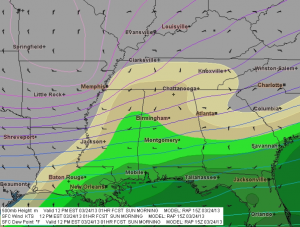
I first began using F5 Data in 2007, and despite its early developmental quirks and my own vast lack of experience at forecasting, I fell in love with it. Storm chaser and program designer Andrew Revering had a solid and unique concept, one that gave me an ample tool for both learning forecasting and chasing storms. In particular, its configurable overlay of RUC maps on top of my GR3 radar images (via Allisonhouse’s data feed) appealed to me. At a glance, I could get a good idea of the kind of environment storms were moving through and into. And I had more than 160 parameters to choose from. I hadn’t an inkling what most of them were for, but they were available to me if ever I learned.
In 2008, Andy made significant upgrades to his product with the addition of color shading and contouring, GFS at 3-hour intervals out to 180 hours, a calculator for instantly converting various units of measurement to other units of measurement ( such as meters per second to knots and miles per hour), and other improvements. The result not only looked attractive and professional, but it offered more solid bang for the buck–and at a little over $14.00 a month, the bucks were easily affordable.
Map Overlays: An Immensely Useful Feature
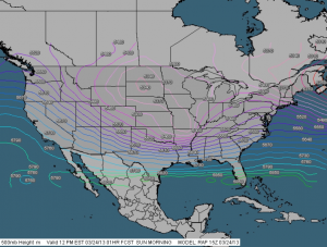
CONUS view showing 500 mb height contours. Note: Images shown here do not correspond to the text example.
At the same time, my own forecasting skills were slowly improving, and as they did, I came to greatly value another key feature of F5 Data: its ability to layer any of its maps on top of each other. This is a hugely useful feature and one I haven’t seen in any other commonly available forecasting resource that doesn’t require more technical skills than I possess. F5 Data is easy and intuitive to use, and as my knowledge grew, so did my appreciation for its map overlays.
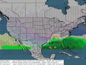
CONUS view with shaded surface dewpoints and surface wind barbs added to 500 mb heights contours. Labels for dewpoints have been turned off.
Say, for instance, I’m looking at the NAM 48-hour forecast for 21Z. I select the 500 mb heights map, choosing the contour setting, and see a trough digging into New Mexico, with diffluence fanning across the Texas/Oklahoma panhandles up into Kansas. How is the boundary layer responding? Switching from contours to shading, I select sea level pressure, and now, superimposed on the H5 heights, I can see a 998 mb low centered in southwest Kansas. Another click adds surface wind barbs, which show a good southeasterly flow toward the low, with an easterly shift across northern Kansas suggesting the location of the warm front. Hmmm, what’s happening with moisture? Deleting the SLP map–I don’t have to, but too many maps creates clutter–I select surface dewpoints. Ah! There’s a nice, broad lobe of 65 degree Tds stretching as far north as Hutchinson, with a dryline dropping south from near Dodge City into Oklahoma and Texas. Another click gives me an overlay of 850 mb dewpoints, revealing that moisture is ample and deep. Still another click shows a 70 knot 500 mb jet core nosing in toward the panhandles.
You get the idea. I can continue to add and subtract maps of all kinds–surface and mixed-layer CAPE, 3 km and 1 km storm-relative helicity, bulk shear, 850 mb wind speed and directional barbs, EHI, STP, moisture convergence, and whatever else I need to satisfy my curiosity about how the system could play out two days hence. I can see at a glance favorable juxtapositions of shear, moisture, lift, and instability per NAM. And I can make similar comparisons with GFS, and on day one, with RAP (which replaced RUC in May 2012).
And Now the Upgrade: Presenting Version 2.6
Everything I’ve written so far has been to set a context for what follows, which is my review of the latest major upgrade to F5 Data. It comess at a time when the number of forecasting products available online has greatly expanded and old standbys have updated in ways that make them marvelously functional. Notably, a number of years ago TwisterData gained rapid and massive acceptance among storm chasers, and it continues to enjoy prominence as a quick, one-stop resource. Like F5 Data, it features GFS, NAM, and RAP, and it also offers point-and-click model soundings, a very handy feature. In 2010, the HRRR brought hourly high-resolution maps to the fray, with its forecast radar images demonstrating considerable accuracy. And the SPC’s Mesoanalysis Graphics, always a stellar chase-day resource, has recently made some dynamite improvements. Today the Internet is a veritable candy store of free forecasting resources.
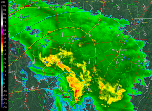
GR3 with F5 mesoanalysis overlay. This one shows surface and 850 mb dewpoints and 850 mb wind barbs. (The blue METARs are an Allisonhouse product.)
At the same time, F5 Data didn’t seem to be doing much, and while I still resorted to it constantly, I wondered whether Andy had lost his passion and commitment to his product. Most troubling to me, the proprietary mesoanalysis maps which had replaced the RUC maps as GR3 overlays often failed to update in a timely manner, rendering them pointless. Given their potential usefulness in the field–how valuable would it be, for instance, to see at a glance that the storm you’re following is moving into greater instability and bulk shear?–I found this disappointing.
But I no longer have any such concerns. This latest upgrade has rendered F5 Data a powerhouse. All the while, Andy was beavering away in the background, fixing bugs and incorporating various client requests into his own set of huge improvements to his creation. Beginning with the February 1, 2013, release of v. 2.5 and moving in seven-league strides toward the latest version, 2.6.1, these changes have been a long time coming, they reflect a lot of work on Andy’s part, and they have been well worth the wait.
Here’s What Is New
The following will give you a quick idea of the more significant changes:
- NAVGEM has been added to the F5 suite of forecast models.
- Users can now draw boundaries, highs, and lows.
- Users can select increments other than the default by which arrow keys advance forecast hours for the different models
- The map now offers an experimental curved-Earth projection.
- Wind barbs at different levels can be overlaid to provide visuals of speed and directional shear.
- Processing is faster (up to 45 minutes faster with GFS)
- Text for geographic maps can now be customized.
And yes, the mesoanalysis maps are now on the money. Andy moved them to a faster server, and they now update regularly and consistently, to the point where I plan to display some of them on my site the way I used to do with the F5 Data RUC maps.
All of the above are in addition to the already existing array of features. A few of these include the following:
- Over 160 parameters, including ones you just don’t find elsewhere, such as the Stensrud Tornado Risk and isentropic surfaces, and also a good number of proprietary products such as the APRWX Tornado Index, APRWX Severe Index, and APRWX Cap.
- Current conditions plus five forecast models: GFS (out to 384 hours), NAM, RAP, hourly mesoanalysis, and the newly added NAVGEM.
- Mesoanalysis integration with radar products via Allisonhouse (already described).
- A point-and-click CONUS grid of forecast soundings.
- Zoom capabilities that let you zero in on areas of interest. Activate the display of cities and roads and target selection gets that much easier.
- National satellite (visible, water vapor, and infrared) and base reflectivity radar composites.
- Fully customizable map overlays (as discussed above).
- 14 categories of maps organized for particular purposes, including Severe, Tornado, Hurricane, Cold Core, Winter, Lift, Shear, and Moisture. These are fully customizable, and you can create your own categories if you wish.
- Watch and warning boxes.
To describe all of the features that F5 Data offers would take too much space and isn’t necessary. You can find out more at the F5 Data website, which includes a whole library of video tutorials on what F5 Data is and how to use it.
Better yet, you can download the software (it’s free) and try it out for yourself with 17 free maps.
If there is any downside to the upgraded F5 Data, it is minor and purely personal. I miss the passing of the historical data feature some months prior to the main upgrade. That feature allowed me to request data for past forecast dates and hours so I could study chase setups from years gone by. I wish I still had that option. However, I understand that it needed to go in order for Andy to move ahead with his changes. The feature was peripheral to the purpose of F5 Data, evidently it didn’t get used much, and it’s a small price to pay for the big improvements to this forecasting resource.
One thing Andy might consider for a future update would be to break down SBCAPE and MLCAPE contours into smaller increments. CAPE is displayed by intervals of 100 from 0–500 J/kg, which is great; but from 500 up to 3,000, it jumps by units of 500 J/kg, and from 3,000 on up it moves 1,000 J/kg at a time. Realistically, these are just overviews of instability, and they’re in keeping with how most other forecast resources display CAPE. If you want to get more granular, you can always check out forecast soundings. Still, it’s an opportunity for F5 Data to provide a somewhat more incremental breakdown similar to that of TwisterData.
With these last two comments dispensed of, I highly recommend to you the new and improved F5 Data. It’s easy to use and flexible as all getout, and it puts a squadron of tools at your disposal, all in one eye-pleasing, zoomable interface. Of course, no one forecasting resource covers all the bases, and that is certainly true of F5 Data. But this is nonetheless a fabulous product that offers some unique advantages. These latest changes, including the addition of NAVGEM, the ability to draw boundaries, and mesoanalysis graphics that update regularly to provide the most current information, have taken an already fine resource and made it dramatically more useful.
Bravo, Andrew Revering! You do great work.
This review, by the way, is unsolicited and unpaid-for. I’ve been a fan of F5 Data and of Andy from the start, and I’m pleased to share my thoughts about the latest iteration of a product I’ve used extensively and benefited from for a good number of years.
